A personal design challenge to re-brand a pivotal feminist organisation in five days for International Women's Day 2022.
EVAW is a leading coalition of specialist women’s support services, researchers, activists, survivors and NGOs working to end violence against women and girls in all its forms. They lobby all levels of UK government to adopt better, more joined up approaches to ending and preventing violence, and challenge cultural attitudes that tolerate and condone abuse. Thus, they have a vital role in advocating for gender equality and challenging systemic and persistent VAWG* in UK society.
As a personal challenge I decided to re-brand this iconic organisation. After completing a small audit I found issues with its messaging and identity. A new brand identity sought to unite EVAW under a more cohesive brand strategy and message. This was applied to print promotional assets and a partial re-design and re-structure of their website and Instagram page.
Job Role
Personal Project (Design Challenge)
Sector
NGO, Political Activism
Personal Project (Design Challenge)
Sector
NGO, Political Activism
* Violence Against Women and Girls
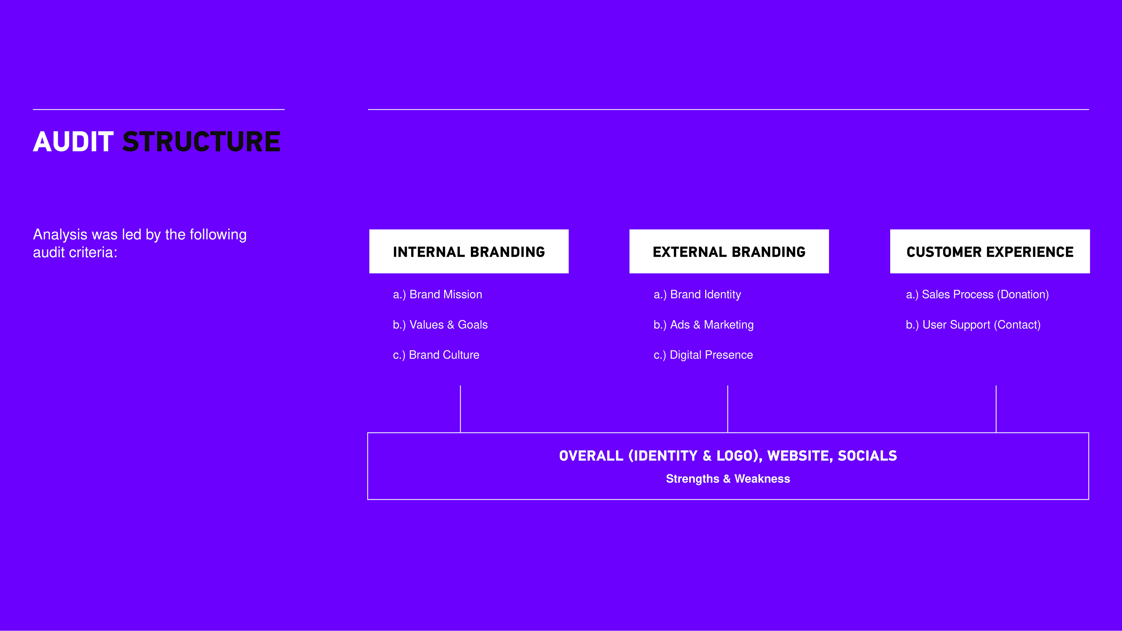
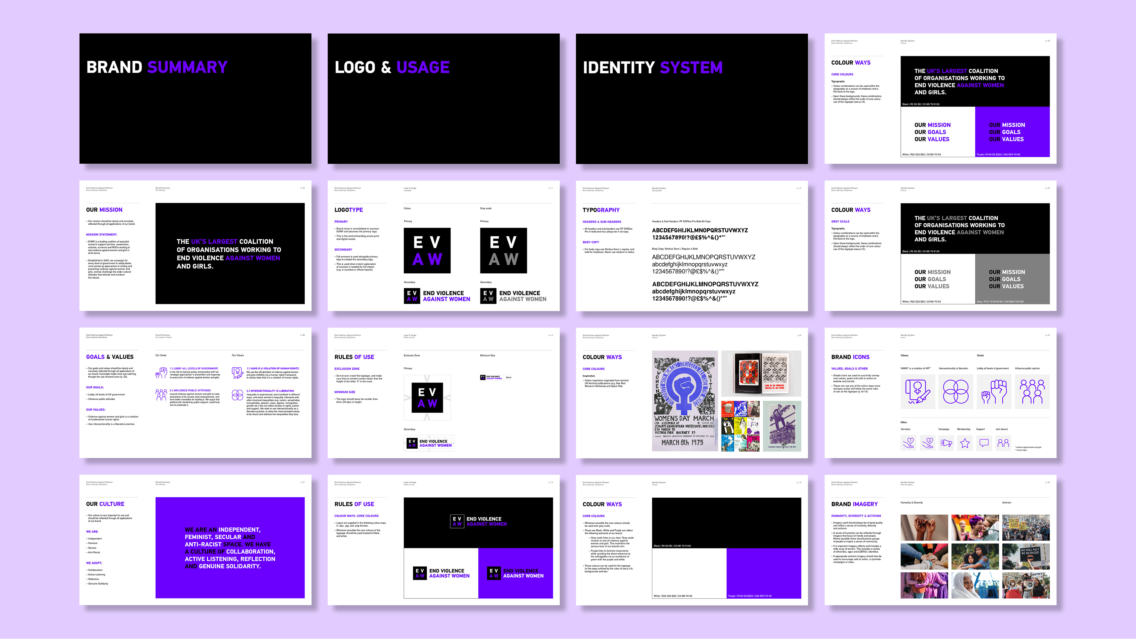
Before beginning this challenge I examined the strengths and weakness of EVWA's internal and external branding as well as elements of customer experience (structure of examination below and full brand audit to the right). Overall I found that despite having clear missions and goals the brand's inconsistencies in naming, overused and outdated colours (in the feminist market) and lack of structure on digital platforms meant these key brand messages were being lost.
To view the full brand audit click here.
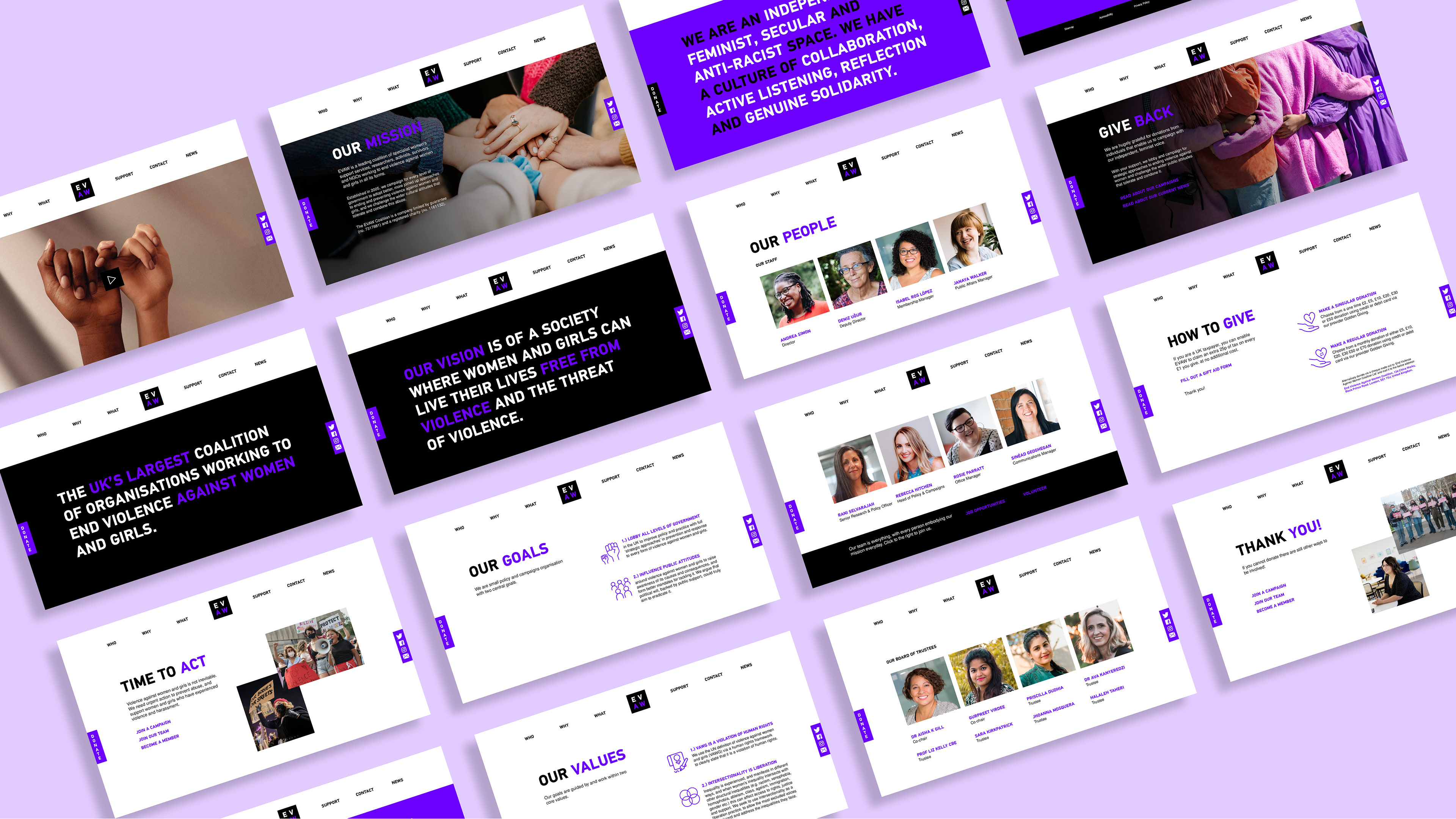
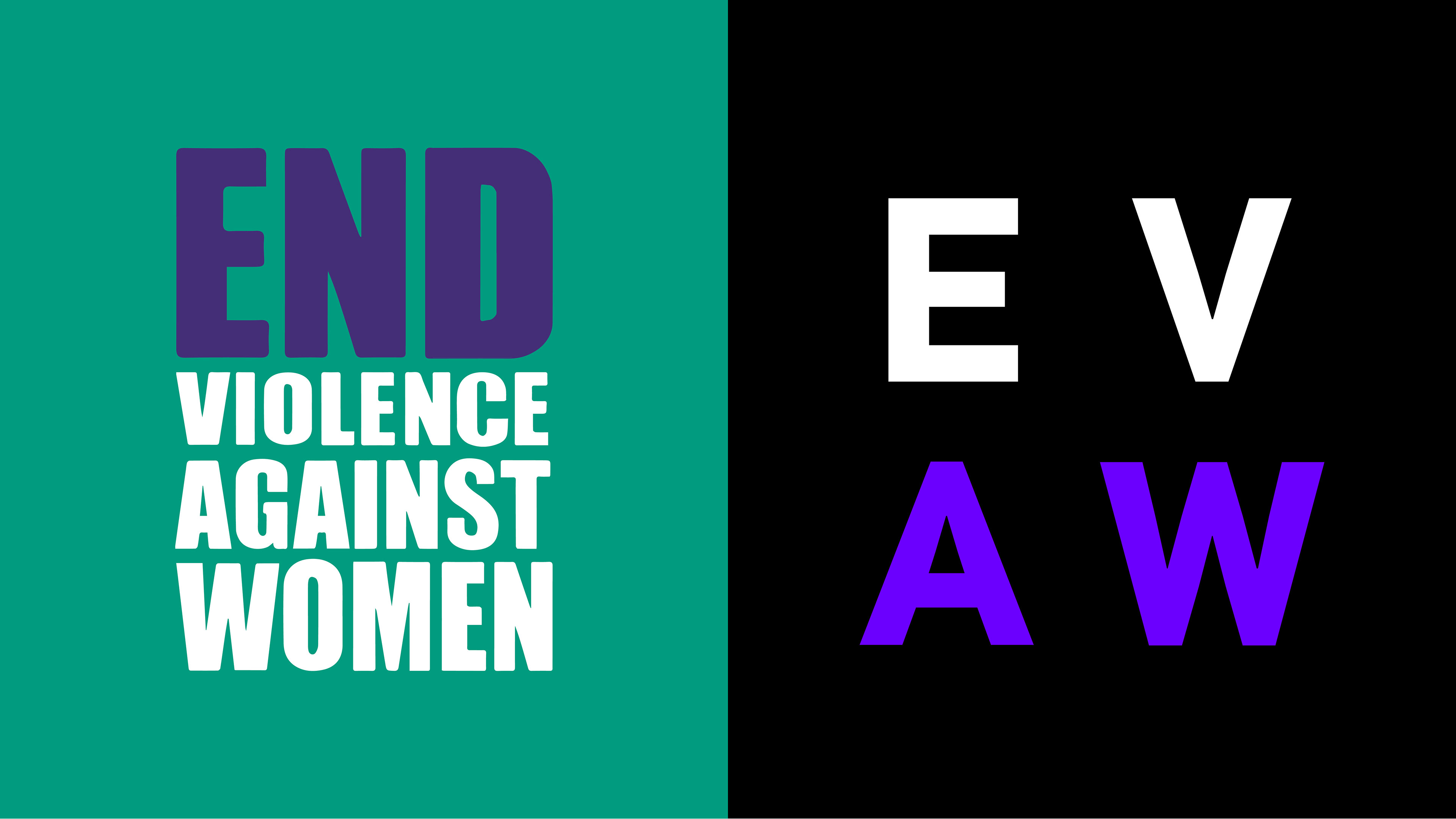
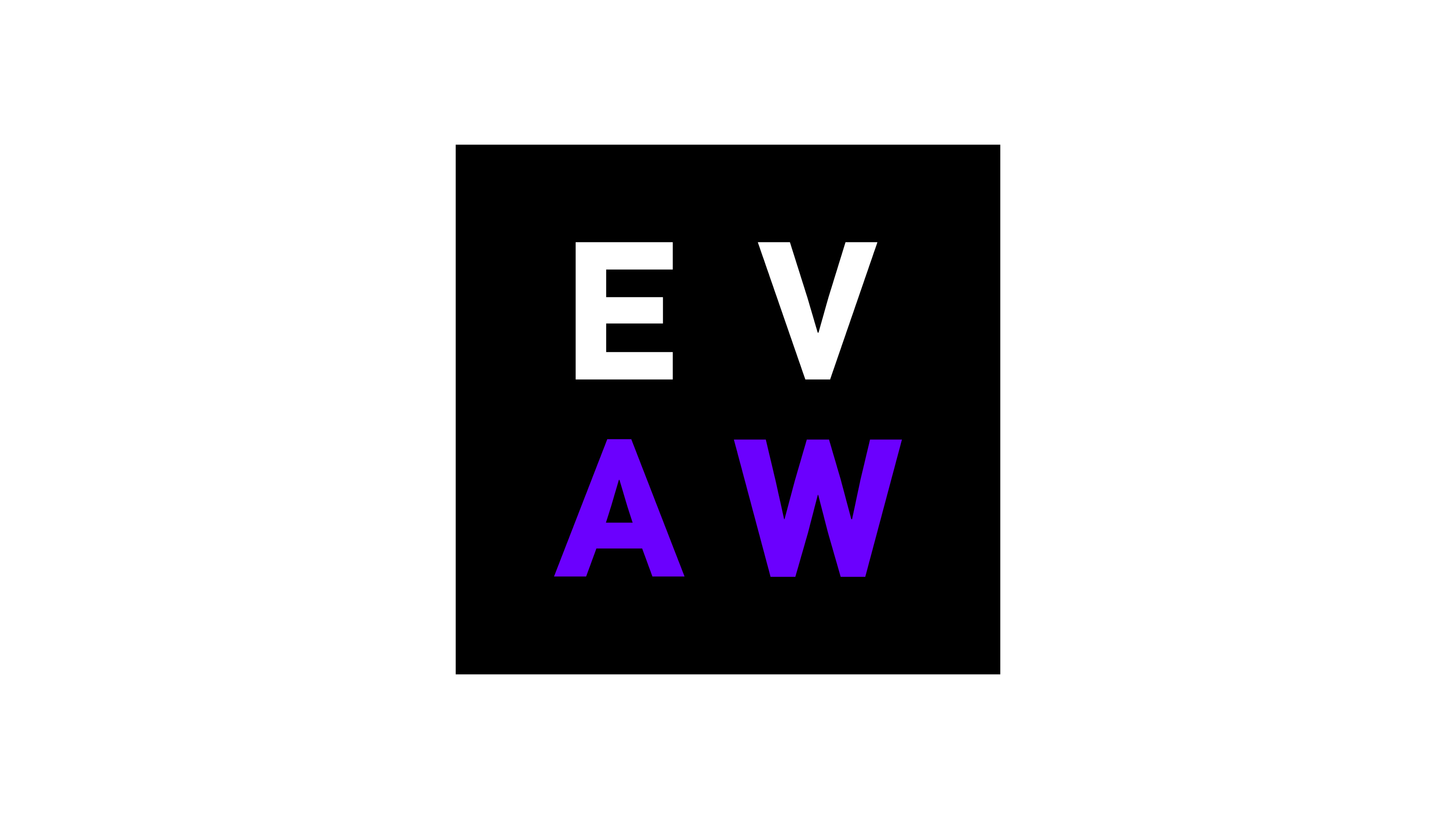
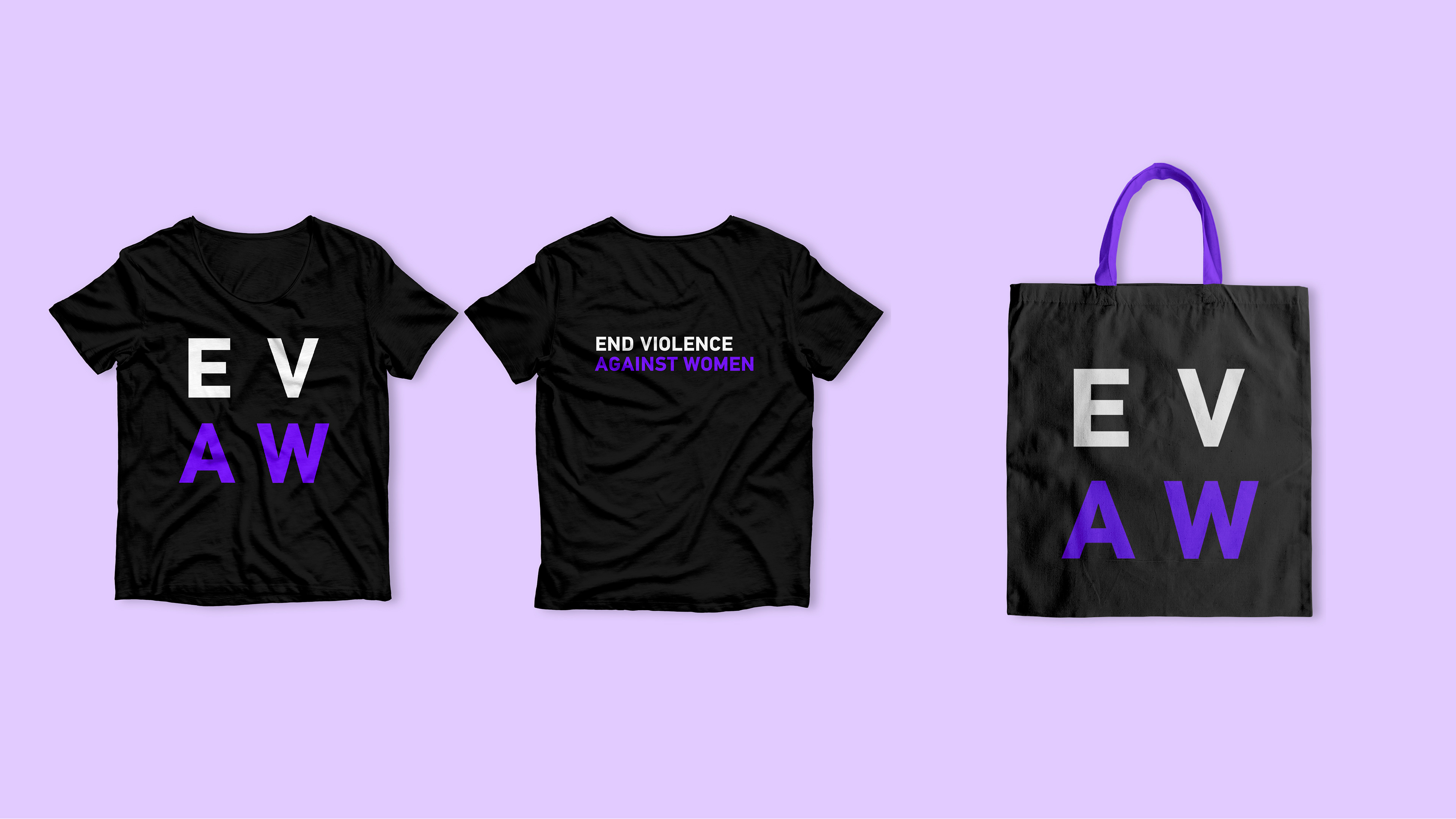
This review highlighted the first and foremost the brand needed a visual update to help it stand out and more clearly convey its goals. The name and primary logo were simplified to the acronym EVAW, creating a symmetrical layout that suggests and equal sign for gender equality. Updated colours inspired by seminal feminist publications helped the brand stand out in the feminist market, giving it a contemporary edge. Black and white represent the brand's direct 'black and white' mission while purple keeps historic relations to feminism. Finally, a review of the photography and creation of new brand icons were also actioned to more clearly visual their values and goals.
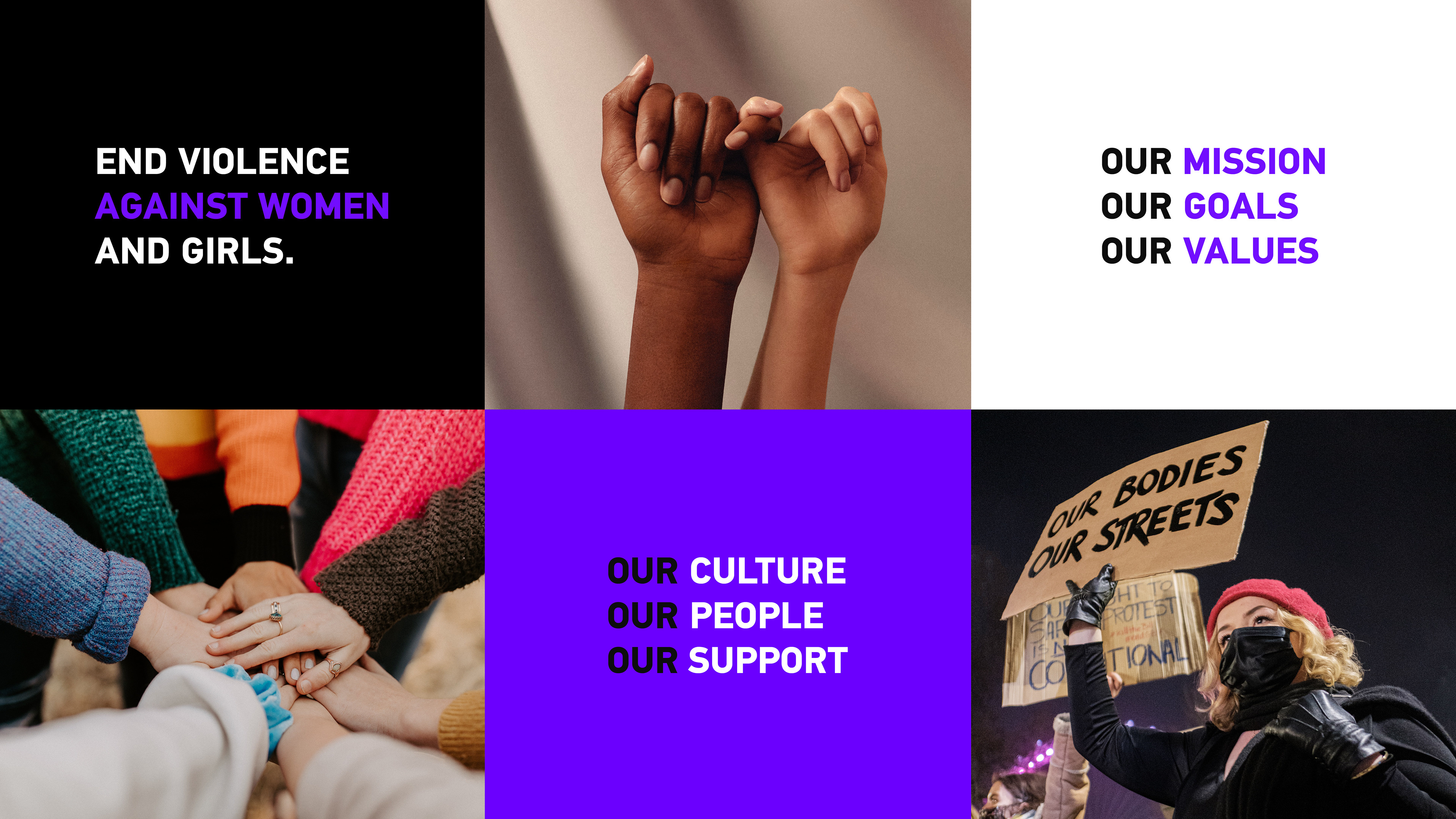


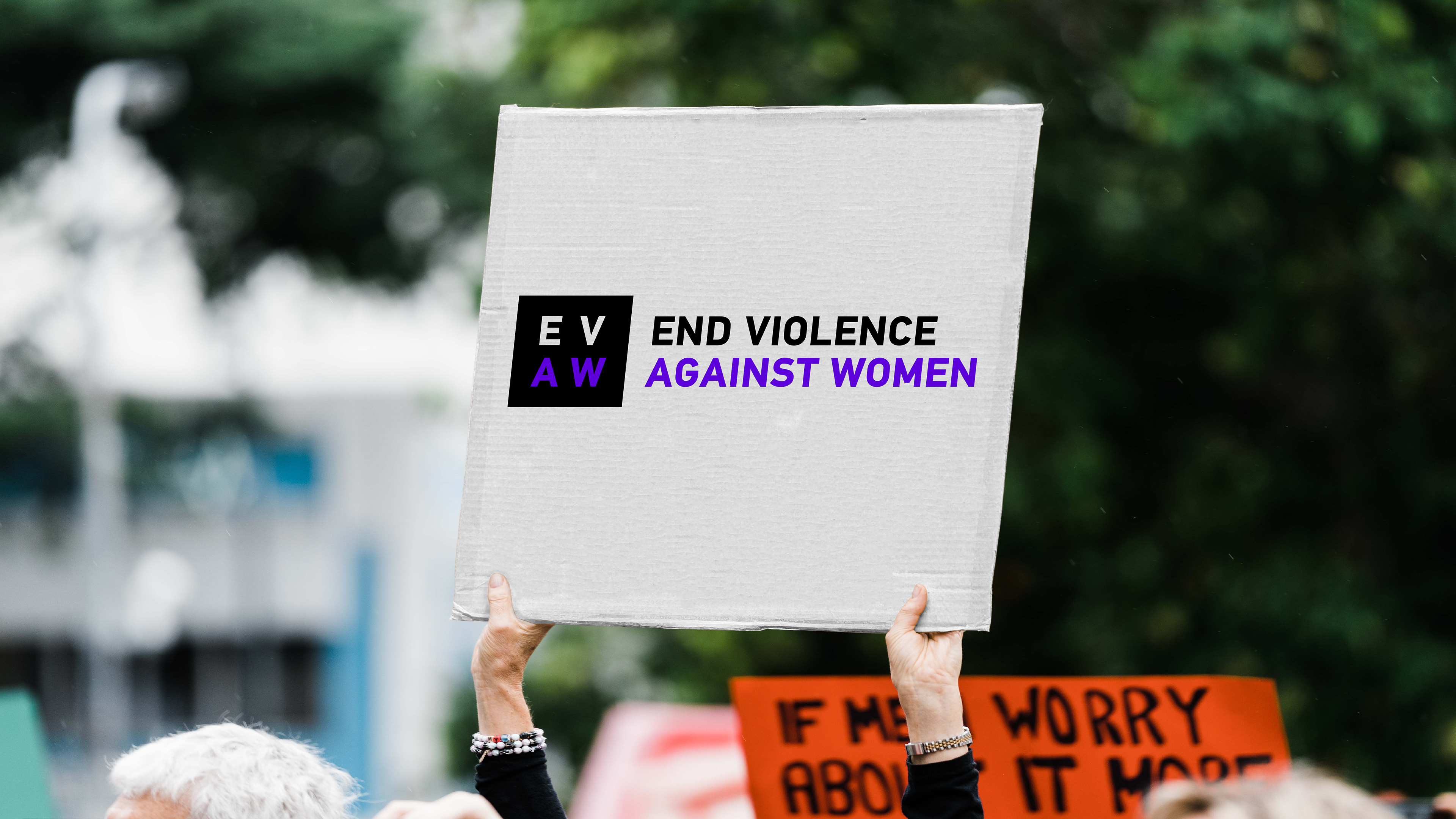
In order to make key brand messages more prominent the website was updated via a re-structuring/designing of pages and the navigation menu, clearer headlining, more concise, reduced or bolder text and more visuals to indicate content. Additionally an inclusion of a video on the homepage helps to summarise all aspects of internal branding. On Instagram this involved creating a more consistent visual style, inclusion of a link tree and highlighting key internal branding elements via stories.
text